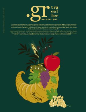
Interview in grtraveller with Michalis Georgiou and Dimitris Stephanidis, creators of G Design Studio
One of the biggest visual arts events in Greece and abroad, Art Athina opens its doors in September at Zappeion with a new visual identity signed by the most acclaimed and award-winning G Design Studio. Its creators, Michalis Georgiou and Dimitris Stephanidis, “guide” grtravellers through the concept behind the new visual identity and the challenges they faced in order to cope with the importance of the institution.

What is the significance for you to create the new visual identity of Art Athina, the largest art event in Greece and one of the oldest fairs in Europe?
It is truly an honour for us to collaborate for the 8th consecutive year with Art Athina, an institution with a deep cultural heritage, under the auspices of the President of the Hellenic Republic, Katerina Sakellaropoulou. Our collaboration with the Hellenic Art Galleries Association (PSEA) and its president, Gianna Grammatopoulou, owner of the “Ekfrasi” gallery, as well as with Antonis Kourkoulos, General Director of Art Athina, represents a relationship of trust and creative synergy. Through this collaboration, we showcase contemporary art and strengthen Art Athina’s position as a leading cultural institution in Greece and internationally.
What is the concept behind the new visual identity?
Creating a visual identity for an institution like Art Athina is a challenge that requires an understanding of both history and the present. What we wanted to achieve was an identity that was simple but strong, that served its purpose but at the same time was inspiring. We thought that Art Athina should not be just another art event, but a pillar that supports and highlights the Greek art scene. Thus, the new identity is based on three versions of the letter “A”, symbolizing the double “AA” – Art Athina. The three-dimensional forms of “A” are inspired by the architecture of the Zappeion, creating a sense of heritage and contemporary dynamism. The bright colours invite the eye and project the explosive spirit of contemporary art.

What challenges did you face during the design process and how did you manage them to achieve the final result?
Every design process is full of challenges and in the case of Art Athina the biggest challenge was to keep the design fresh and innovative, without compromising the continuity of the institution’s identity. Keeping something consistent and at the same time making it look new is an art in itself. In this year’s identity, we had to find ways to showcase the boldness and energy of Art Athina without being over the top. So we kept the design flexible, allowing elements to evolve in different mediums, and let the intensity of the color palette and dynamic shapes set the tone.

What is the central message you wanted to communicate through the new visual identity, and how does it reflect Art Athina’s character as a cultural institution?
The central message of Art Athina’s new identity is that art is not just decoration – it is an expression of power, a force for change. The new identity brings Art Athina to the forefront, not just as a place for art, but as an institution that leads the times, inviting the public to see art through the lens of contemporary issues. We wanted to create a bridge between the past and the present, highlighting the vibrancy and dynamism of the institution in a way that is accessible to all, while projecting a bold and contemporary character.
What creative choices (colours, typography, graphic elements) do you feel contribute most to differentiating Art Athina’s new identity compared to previous years and other art fairs?

What creative choices (colours, typography, graphic elements) do you feel contribute most to differentiating Art Athina’s new identity compared to previous years and other art fairs?
What makes this year’s Art Athina identity stand out is the combination of simplicity and intensity. Last year, our approach was more subtle, emphasizing typography and simplicity to let the art speak for itself. This year, however, Art Athina takes the spotlight, turning the identity itself into a work of art. The
explosive colours and dynamic forms are not limited to accompanying the art – it is the identity itself that wants to be part of the dialogue. The choice of colour and typography is designed to evoke an emotional response, while the three-dimensional shapes of the “A” differentiate the event from other foirs, giving it a unique and recognisable presence.


